Design Principles Document

Alejandra C. Black

Contrast

Under Armour
underarmour.com

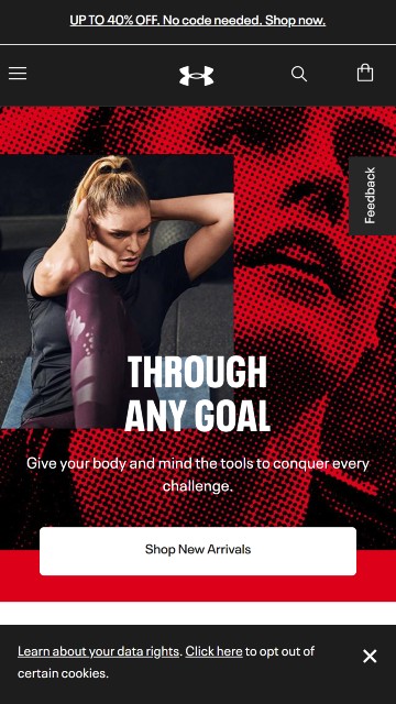
Screenshot of the Under Armour Website on cell phone view. Home page shows an woman doing set ups.

Contrast is when two or more very different (opposite) elements are placed together on the page. It can aid to legibly improve, visual interest, organization and hierarchy, and in highlighting main messages. Contrast is achieved using colors, sizes, shapes, textures, saturation, and position or alignment.
This Underarmour Sports Wear advertisement is a good example of contrast with the use of opposite colors and textures. The home page features red, black and white colors on the image and fonts that contrast each other making them "pop" on the page attracting the viewer's attention.
Repetition

PBS Kids

pbskids.org

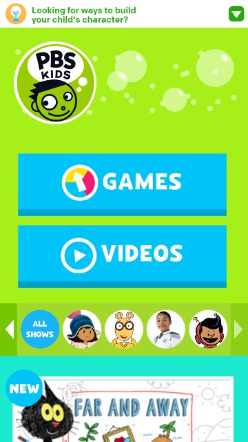
Screenshot of pbskids.org Website on cell phone view. Home page shows logo and some images of the shows the program offers.

The Principle of Repetition is applied when the same or similar elements are used throughout a design. It portraits a sense of harmony and consistency.
PBS KIDS home page is a perfect example of repetition in design. The logo's circle shape is also utilized on the icons throughout the site.

Visual Hierarchy

Dillard's

dillards.com

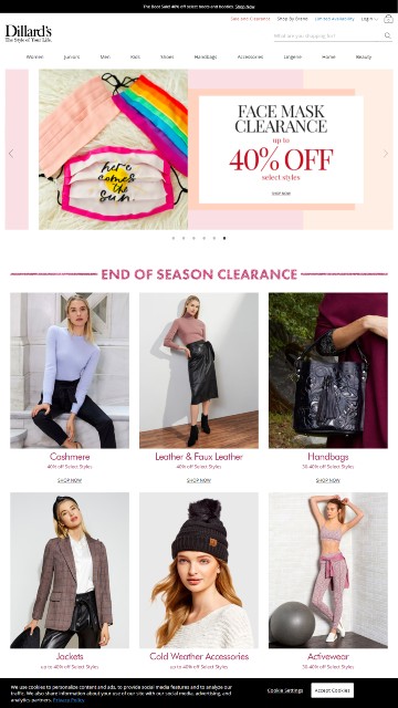
Screen shot of dillars.com Website on cell phone view. Home page shows the deal of the week and the images of the end of the season clearance

Visual Hierarchy is a fundamental principle in design. It's the arrangement of elements on the page in order of importance. It can be achieved with the proper use of scale, colors and contrast, type, spacing, and composition. It helps the viewer focus and aids in helping them understand the information in a clear way. It also influences on the user's discernment and leads them to actions.
The image above from Dillard's Stores home page is a great example where Hierarchy has been applied. In order of importance:
#1 Image of the "Face masks" and it respective 40% off advertisement.
#2 "End of Season Clearance" section with all the different images perfectly lined up.
#3 Logo
#4 Navigation Bar
#5 Footer and Search input area